Design analysis
In this design analysis I went with one of the posters of Dutch graphic designer Wim Crouwel, who passed away earlier this month. Grids are a big part of his work and in some of his work the grid even remains visible. For Crouwel grids weren’t just part of his graphic design work: ‘I always tend to put all the items on a table straight. Every time I see something that is off, I will put it straight. It’s a doleful habit, but I have once decided on doing this.’
The grid system

I decided on using the ‘beeldje voor beeldje’ (image per image) poster, which was made for an exhibition taking place in 1974 in the Stedelijk Museum. The exhibition is about animation and the poster is therefor quite clever. It’s showing portions of five different frames, and because every frame is getting a little smaller it also shows speed.
The grid is a little off. I can imagine that there is probably a more refined grid underneath this (maybe just squares). It could also be a little off because it’s a scan, but also because it’s hand-drawn by Crouwel. One of the museum conservators at the Stedelijk notes that they once tried to replicate one of Crouwel’s posters with a computer, but that it became ‘a complete failure’. Not sure if this is an ‘aura of the original’-argument, but I do notice that being completely true to a grid can also be quite restraining.
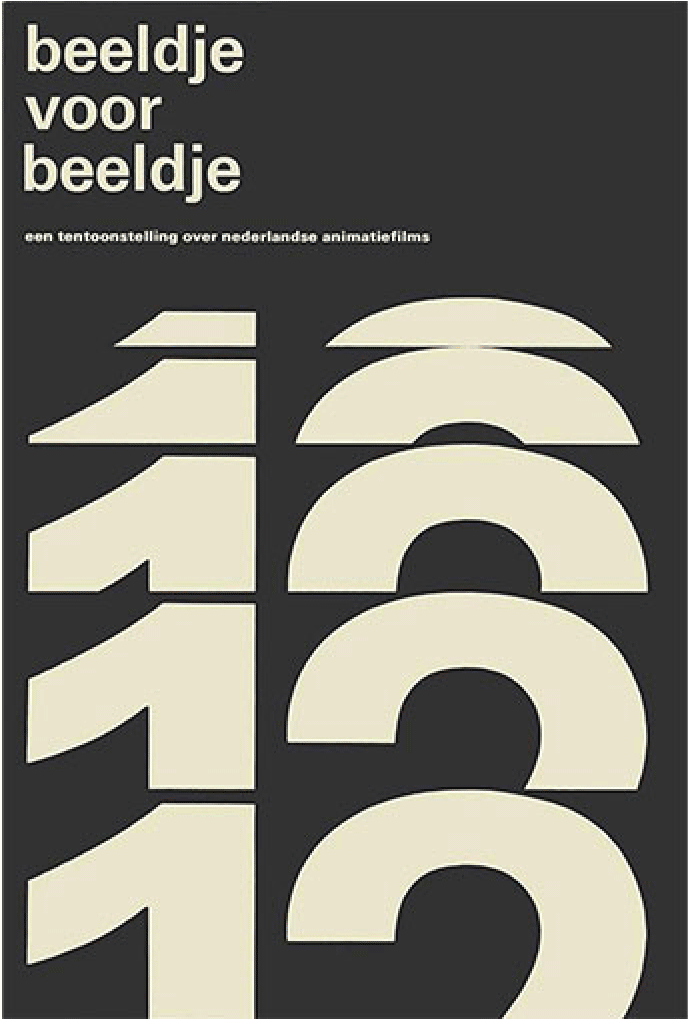
Hierarchy

There’s a heading (beeldje voor beeldje), a tagline (een tentoonstelling over nederlandse animatiefilms) and a big graphical element (12) which is also a font.
The graphical element has the largest font size. The stem of the 1 has a consistant width, which indicates that the font sizes are the same.
The viewing direction first focusses on this element. Then it flows on to the heading (beeldje voor beeldje) and finally it ends at the tagline.
Crouwel didn’t use any caps. Even in words that should be written in caps like the name of a country (Nederland).
The font seems to be Univers, a classic sans serif designed by Swiss type designer Adrian Frutiger in the 50’s. What seems to be characteristic for this font are the bowls that are getting thinner once they hit the stem. And the rather minimal terminal (?) that is used to create a j.
Colors

Color usage is minimal. There’s a dark gray and a yellowish gray. All the colors used in Crouwel’s work is rather minimal. I could not find a poster designed by that uses more than four colors, and most of the work uses a maximum of two.
The Stedelijk opened up a memorial website where visitors can browse through his work and leave a memory.